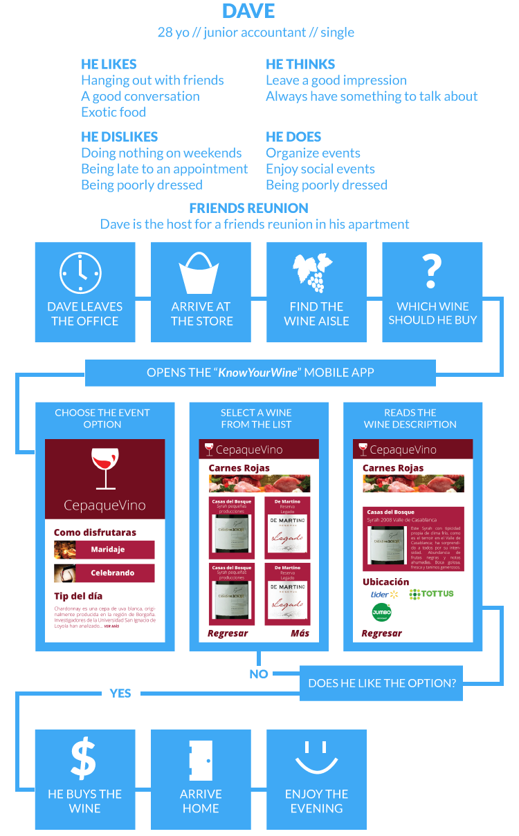
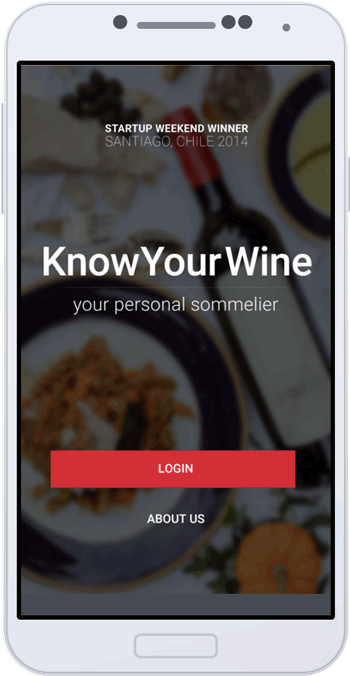
KnowYourWine is the English translation from Spanish for CepaQueVino. This idea was researched, tested and finally pitched during the Startup Weekend Santiago 2014 an event organized by Google Entrepreneurs. During the lapse of 54 hours we develop a business idea based on the userscentered design methods. At the end of the event we got first place among 10+ projects.
During the event I got to lead the design area of the app, and work as a liaison between the businesses area and the programmers. As a lead designer I drove the idea of getting to know the “pains” of the users in order to focus the whole design idea of the app. As a liaison I streamlined communications among all the group, so we can understand the feasibility of the ideas and prioritize the development of the product.
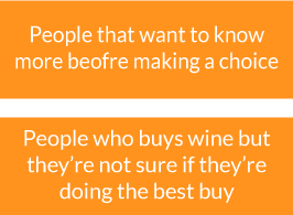
The group goal is to understand the users so they can become our customers, given them what they need before they need it. My goal was to provide that information in the most efficient and friendly way to the user
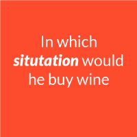
What is the process that the user follow in order to buy a bottle of wine? Once they decided they need to buy one, the person can either pick-up any bottle or rationalize his pick. Is in that moment we would enter to form part of the process and help the person choose the best option.
Startup weekend is all about iterate and test your ideas, the faster you fail the closer you get to the right answer. We choose to try a quick process to test our hypothesis, by following the cycle (Research, Design, Evaluate) we can refine the idea in the shortest amount of time.
Wine culture in Chile is big and widely supported, which came handy when doing a research. We went to hub spots, to find more about wine. This is what we discovered.
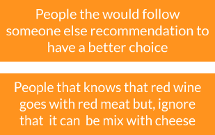
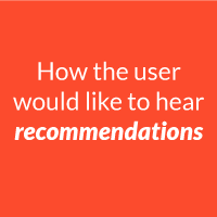
We hypothesized that users would like to hear recommendations, now we are certain about it. We also evaluated existing services just to know if someone else have also come to the same conclusion. We find out that there are existing apps that help users gather more information about each bottle of wine, like reviews and similar wines.

We brainstormed our new ideas and organized by groups and
try to find a pattern among them. After a few rounds of this process and we finally came up with an idea.
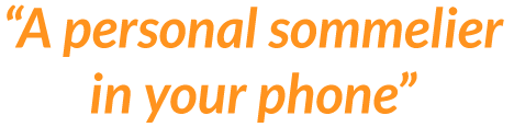
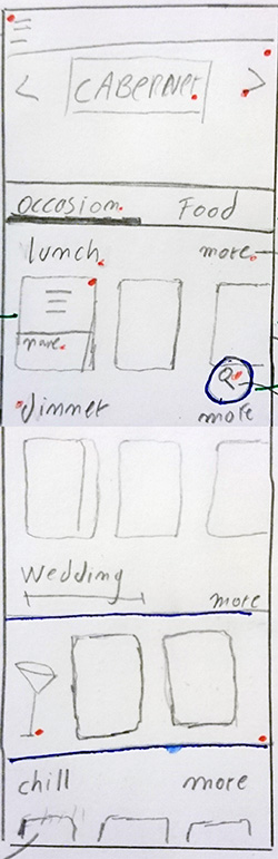
I designed an app that would help users find out their best options depending on the situation that they would find themselves in. This quick user journey would explain the situation of user in her first date.
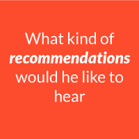
This mockup was created during the event and in this video I used InVision to create this clickable prototype and showcase the primary functions of the app. The user is able to choose which kind of recommendation he would like to receive (events or food) and a few tips for wine enthusiasts.
It was my first Startup Weekend and was an incredible learning
experience, just to see how quickly and idea can be tested, iterated and
finally delivered in just one weekend makes you wonder how many ideas could
become a reality, is just a matter of just doing it.

A redesign is a necessary exercise to practice and improve design abilities but not certainly to prove the user point of view, nevertheless if in the design process a user research is implemented it gets validation from the users, and the redesign get a purpose; to solve an user problem/need/pain.
The following redesign follows the ideas, research and validation from the Startup Weekend where this idea came to fruition. During that weekend I got the opportunity to make a quick sketch of how the app look & feel. But further iterations were needed in order to call it a “High Fidelity Mock-up”. This is the process I followed to redesign it.
Usually before drafting/drawing any screen, I like to gather information that would help me understand the user, in this occasion I would carry on with the information gathered during the Startup Weekend (SUW). I can start with this description of the user.
The user is a wine enthusiast. He have an average understanding of wines and is willing to gather more knowledge.
Having this idea in mind, I tried to describe what points would the user would be more interested to know, as a result it came down to 3 categories/types of information.
Wine - Food - Celebration
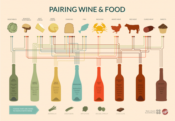
This map from Wine Folley helps to put the overwhelming amount of information that need to be delivered in perspective. I also need to keep in mind that I need to pair the wine with the celebrations/events. Just as the map above there is a seamless never ending amount of information from where we can choose, for the sake of simplicity of this exercise I will follow the research from the SUW.
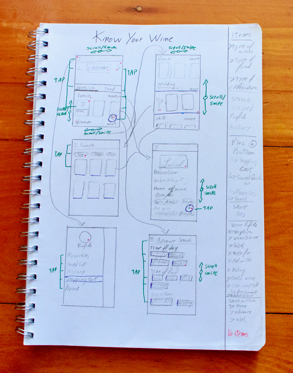
Drafting is a wonderful tool, is quick, practical and easy
to show other team members your concept idea. When I draft I like to start with the elements that would help the user solve their problem, not only that, but elements that the element wont expect but would help him.
So far I know that the user would be able to buy the right wine bottle for any occasion but, does he knows where to buy the bottle? Putting yourself in the perspective of the user, using tools like personas and scenarios, help me realize other situations in which this service (app) have not contemplated yet.
On the right side of the notebook, is a space I use to write
down quick ideas that comes to mind while drafting, which is a reminder as I continue drawing. I like to draw small boxes first so I can keep the context of the whole app on a quick glimpse of the page. Later on it could be re-drawn if required or it can go straight to Illustrator (my personal favourite designing tool at the moment).
The first box (upper left corner), represents the home screen. I will describe the screen from top to bottom.
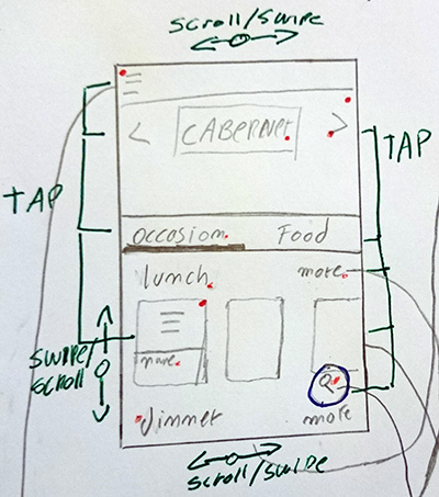
Menu section
Will give access to the “menu drawer” that would feature other options (there is arrow which point out to that screen).
Hero section
Is a carrousel of images that gave access to small articles with useful information like “How to preserve wine after opening it”. I find it useful in this location because is easy to reach and the user can see it. Another location could be between the wine sections but that could be tested in the following steps.
Tabs section
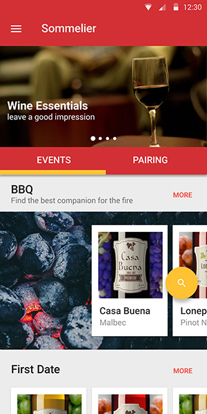
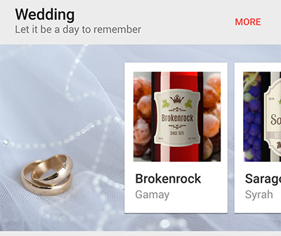
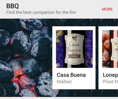
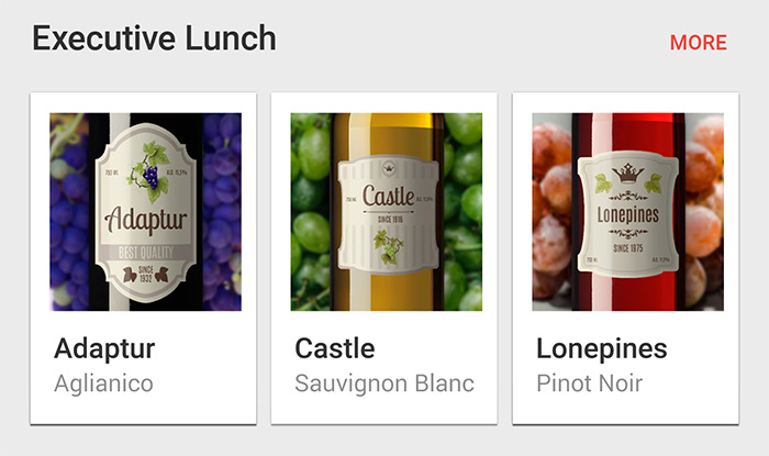
Here I decided to select 2 section to represent the categories that the user would need in order to solve their problem. "Occasion” is the first option (and is already selected) due to be our biggest selling point. Our app helps you to select a wine based on your event instead of the food you would take (this a pretty common service).
Wine sections
Here is where the wines would be displayed and properly organized with some categories being more prominent than others (to showcase a special occasion). Each category would display 3 bottles (displaying more would decrease the size of the images which would at the same time decrease the user ability to differentiate the bottles). It is a carrousel that can be swipe to the right to see more wine bottles. There is the “more” button that would take the user to different page with more options.
Search Button
I find the search button as a relieve valve, it is difficult to say that every user would be able to find everything they need right away, even experienced user would find it useful. The search Button allows the user to search by events, food, and wines. The user would be able to find the content quicker than if he decides to browse around, particularly if he already knows what he is looking for.
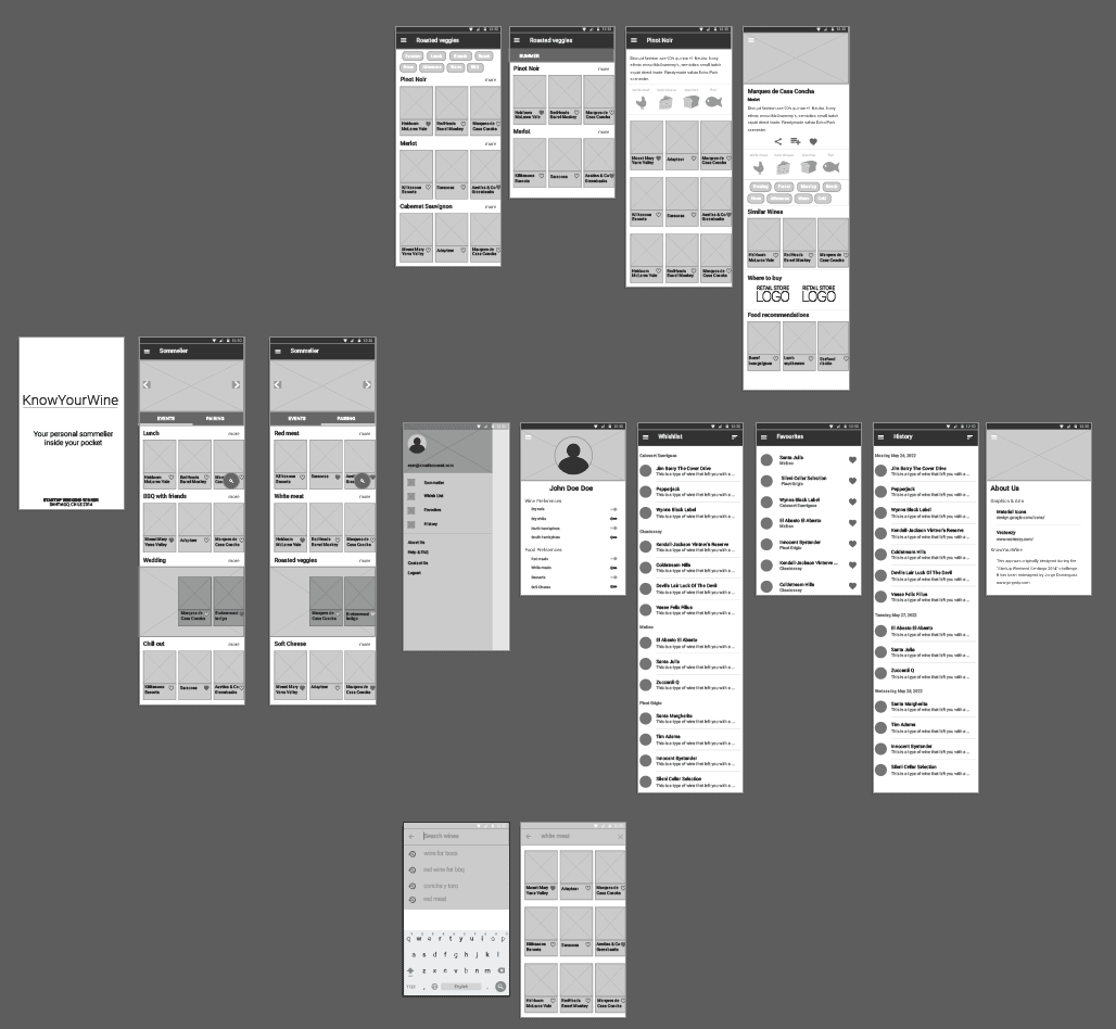
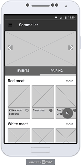
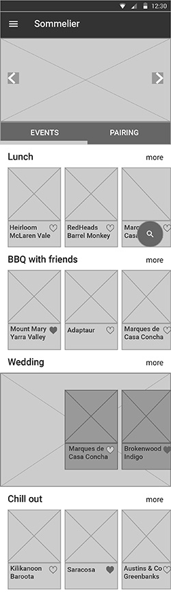
Once the draft is properly validated (by mean of user testing, teammates or other), the best idea is to get a wireframe, it settles down the idea and communicate in a clear way the whole functioning of the app. Is not the step where colours are decided neither the style nor the animations. This step can be presented as prototype and use it with users and validate that it solve the problem from the user.
For this exercise I designed the whole app, it is worth mentioning that this is not necessary to do it in every project, but I wanted to see how a whole journey around this app would look It give me a better understanding of the app, the limitations of the present design and what could be improve (of course improving is part of every step). This image showcase the complete wireframe design.
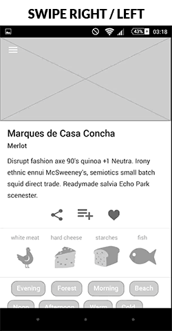
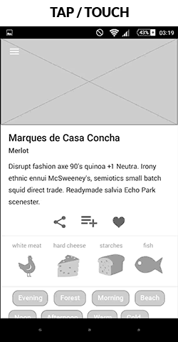
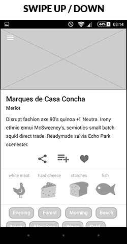
Now that the wireframe are ready it would be a good time to add a “interaction layer”, in other words show your team what kind of gestures does the user have to perform to interact with the app. I will use the “Wine Description” screen to show the interactions that should be used here.
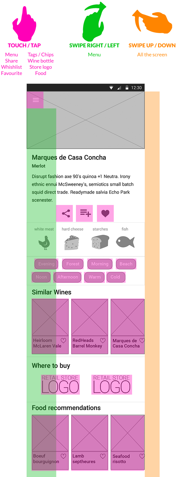
This screen allow the user can interact with 3 different
gestures there are marked with different colours. Is also advisable to create an animation that shows how exactly the app would react to gestures used by the user. Below are 3 screens, each one represent a different gesture.
Now I will link the screens, this would help
realize how the user would navigate through the app step by step. It helps to establish a specific goal and complete it, this way if there any mistakes or any screen that is missing, it would come out.
For this type of exercise I particularly like to work with InVision I found it practical, and easy to use within a team. This is the app partially integrated with all the screens, you can give it a try (not working on mobile portrait ).
Access this LINK to visit the project inside InVision.
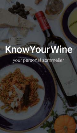
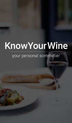
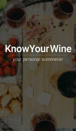
Once I reach this step is certainly that the app functionality is clear for the user, or at least it have been tested thoughtfully. In this step I choose a color palette and a style to follow through the design.
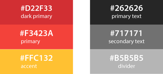
For this exercise I decided to follow Material Design from Google, if you watch closely enough I been following the Material Design guidelines since the wireframes. Is
pretty clear what a couple of good photos can do for your design, with theright colors everything looks much vivid.Now here is a retrospective from the beginning of the exercise until now.
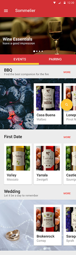
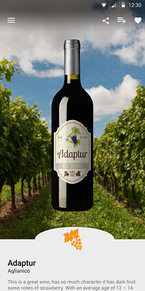
My major challenge were the wine bottles inside the thumbs, originally I wanted to use just the labels, but labels nowadays have a huge diversity, so I just stick with a close up on the bottle. The background of each bottle match the color, if it white wine the background are green grapes and so on. The background for the major events are tricky, the idea is that the composition of the photo or design represent the title is just one third of the image. The result is obvious, it looks good. The “floating buttons” which follow the idea of the “call to action” (highly contrasting color) are really helpful, in this case I do want to let the user known that there is an option to search. This screen would have an infinite scroll.
In this design exercise I created 6 screens, which I believe are enough to make convincing demonstration of the idea to anyone who haven’t heard of it. The person would have a solid idea what is this app about without much explanation, and if someone believe is a real app even better (that is the objective).
This video demonstrate the completion of the redesign of the app and how to perform a successful search of a bottle of wine for wedding during winter.
The steps taken are as follow:
Login > Wedding event > more > Winter > Adaptur > Menu > Logout.
Finally, I would like to share with you the InVision LINK were you can access and play with this mockup, or just use it in here. Enjoy it!
 back to the top >>